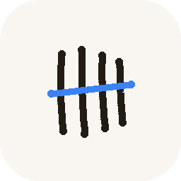
The old logo was a flask. A generic, teal, could-belong-to-any-lab-app-in-existence flask, sitting there since the Labmate days without anyone actually deciding it was wrong — it wasn't bad, exactly, it was just the visual equivalent of a stock photo. A flask reads as "science" the way a stethoscope reads as "doctor." Accurate, and completely interchangeable with a hundred other apps.
Four tally marks and one strikethrough is a different kind of claim: counting experiments as they happen, one at a time, crossed off as they finish. It's a smaller, stranger mark than a flask, and it says something specific about what the app is actually for instead of just what category it lives in.
The raw source assets landed this day, weeks ahead of the icon actually being wired into a launcher icon, an app bar, or a splash screen anywhere. Deciding on a mark and shipping it everywhere it needs to live turned out to be two very different amounts of work — the decision took an afternoon; making it show up correctly across Android's adaptive icon system, iOS's alpha-channel rules, and a web favicon took another day entirely, three weeks later.